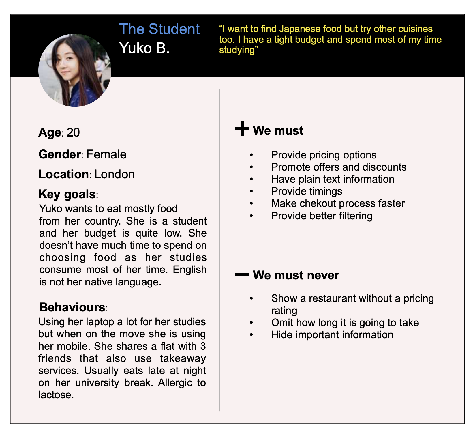
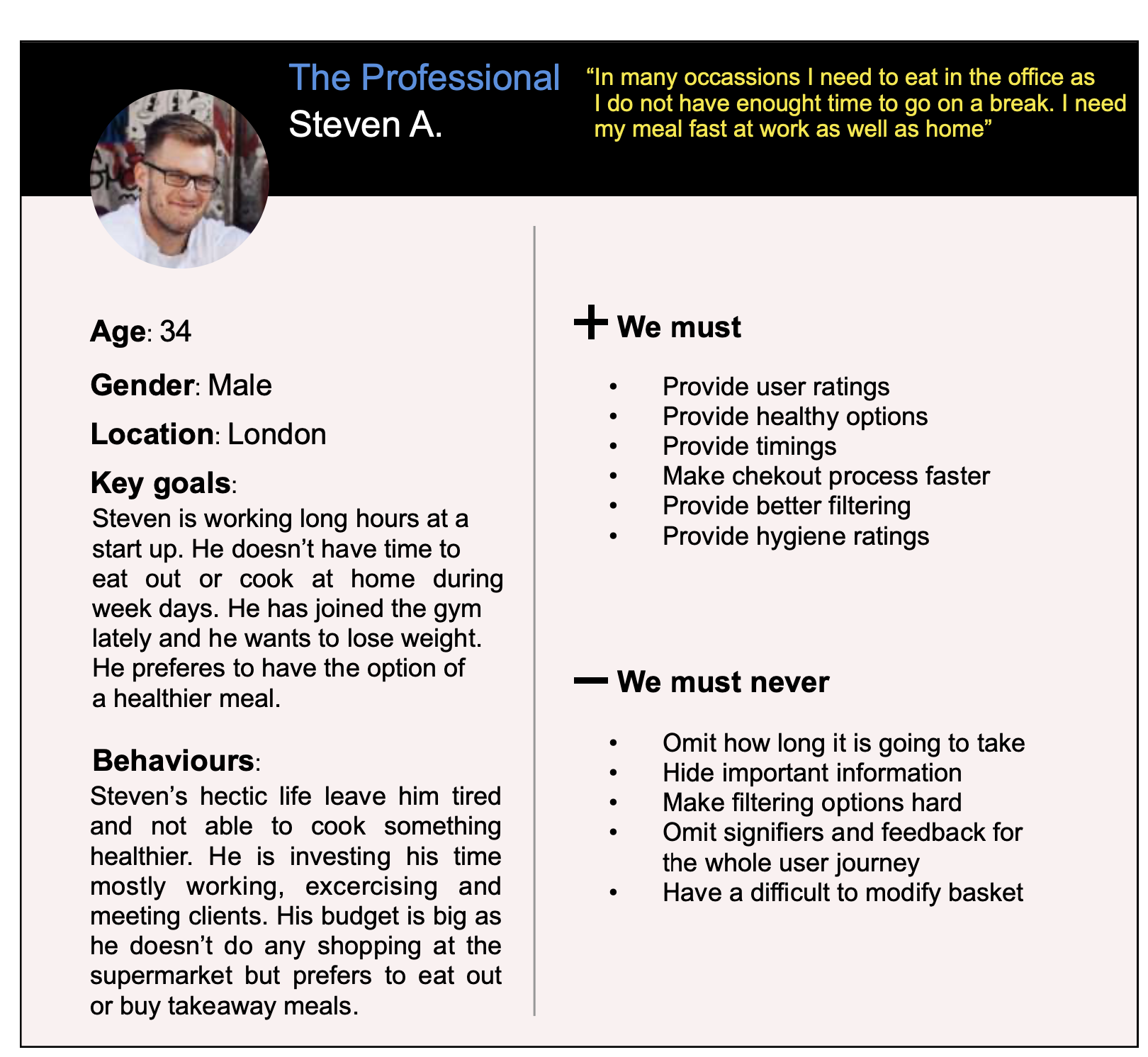
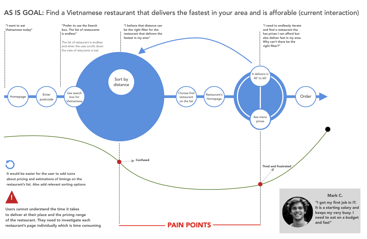
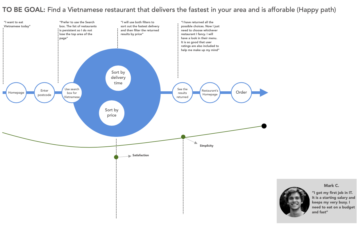
Back

Just Eat

This is a project I worked on for my first year of my MSc and it was an exercise of applying usability testing and eye tracking in order to re-design a commercial product of our choice.

My role

Product Design

User research, prototyping, UI Design

Results

Qualitative and Quantitative data

Usability testing

Sketch prototypes

High-fidelity prototypes

THE PROCESS FOLLOWED TO COMPLETE THE PROJECT

About the project

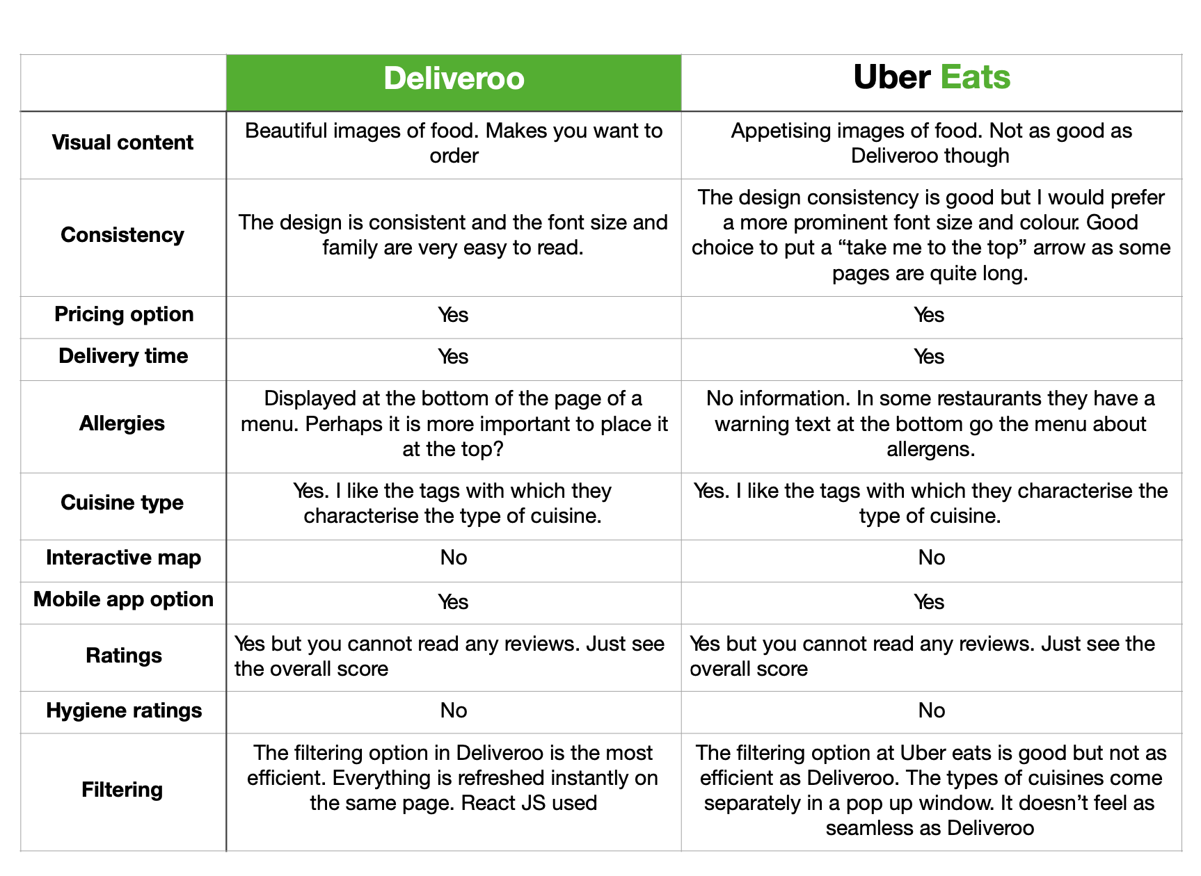
I have decided to re-design the desktop web application of Just Eat because at the time of working on this project I personally was struggling to use the service. As a person that is eating takeaways very often using services such as Deliveroo and Ubereats I wanted to try something different. Just Eat has been a leader in the online takeaway food market worldwide offering to the customers a secure platform for ordering and paying for food from the restaurant partners. On average, it is processing 3 orders per second in the UK thanks to their nine million customers and the company’s value has reached £5.5bn, twice as much as M&S. Whereas the native app is more usable, the desktop web application was suffering of major usability issues.

TAKEAWAYS ARE REFLECTIVE OF CHANGING HEALTH BEHAVIOURS
FORECAST TOTAL HOYSEHOLD TAKEAWAY EXPENDITURE PREDICTION

UX Challenges

Since there is a growing demand for takeaway food, a shifting in the users eating habits and the market shows that the business will grow rapidly in the next 3 years, I believe that Just Eat needs to improve their services as new applications such as Deliveroo and Uber Eats emerged. I believe that this is the time to be more competitive, focus in the future of this industry and try to see what the latest products do well or even better than them, so they can stay on the top of the list.

UX Research

In order to get a better idea of the market , I did a competitive analysis trying to find out what the other companies do well and what not so well. I used parameters such as the information they provide about the restaurants, the food delivery, the ratings, the aesthetics and the interaction. I used only the website versions on a desktop computer.

GRAPHICAL REPRESENTATION OF THE HEURISTIC EVALUATION SEVERITY RANGE

I decided to use a one-shot test because I didn’t want to compare Just Eat to other systems such as Deliveroo and Uber Eats but actually wanted to see how novice users of the Just Eat system feel about the website application, how easy it is to learn how to use it and how and what needs improvement.


Despite the increasing use of mobile devices has shifted consumers to use the Just Eat application, there are still lots of users that do not have a smart phone, have difficulties focusing on a smaller screen or prefer to use a computer (elder people).

RESEARCH QUESTIONS FOR USABILITY TESTING

In order to identify possible usability issues I decided to run a heuristic analysis. Based on the results the major usability issues that users will encounter with this interface will be issues with effectiveness, efficiency, memorability and satisfaction. Finally, I believe that learnability and discoverability can be an important usability issue for Just Eat.


I followed a within- subject or repeated measures type of comparison as I wanted to find out how a particular group of users (novice) interacts with the product by comparing measures such as time to complete tasks, how easy it is to learn the website application, errors, assists etc. The differences in the data would not be a result of the different level of expertise, but a result of the different metrics between the same set of users. The problem I thought I might encounter is the ‘carryover effects”, which is the result of practise using a product and might compromise the performance and skew data. The solution was to counterbalance the order of the tasks beforehand, so each participant follows a different order of tasks.

TABLE OF PARTICIPANTS AND HOW TASKS WERE COUNTERBALANCED

I created a table of design recommendations to use for the prototype for each user pain point and prioritised them according to the severance rating.


The usability testing followed a survey on survey monkey and a SUS questionnaire. The final results can be seen in the next visual.

USABILITY TESTING, QUESTIONNAIRES AND SURVEY RESULTS

The main demographic of Just Eat consumers is families and students. Families place order of bigger value, whereas students keep it cheap and for fewer people. The shifting of lifestyle towards busy routines and the growing variety of takeaway food, especially the healthier options available, has shaped the consumer’s preferences. They prefer meals, convinient to their busy schedules and they see takeaway food delivery as a daily food habit. Men are buying takeaway food more often.


My next step was to create a set of personas based on the research I have done about the target audience and the sample of participants I had for the testing. Based on the personas I drew a Task Analysis Models that showed for each persona the way users sequence their actions and what pain points find and where.

UX Solutions

I did a Hierarchical Task Analysis for the same tasks I provided in the usability testing. The reason was that I wanted to graphically represent the as-is interaction versus the to-be interaction which is going to mirror the design recommendations from the table of usability issues and Object Analysis. Below it we see the emotional map of the user.


AS-IS INTERACTION FOR ORDERING SPECIFIC TYPE OF FOOD THAT DELIVERS FASTER AND IS AFFFORDABLE
TO-BE INTERACTION FOR THE SAME TASK WHERE THE PAINPOINTS OF THE INTERACTION HAVE BEEN DEALT WITH

I created a style guide for the prototype and annotations about the interaction patterns and the effects they should produce and documented everything before start working on the prototype. The next steps would be to re-design the prototype according to user's feedback from a second round of usability testing. More details about the project can be found in the links below.